


Cities
19.04.22
Cities
Google Mobility Reports
The Community Mobility Reports by Google aim to provide insights into what has changed in response to policies aimed at stopping COVID-19. Learn here how Google tries to help to prevent the spread of COVID-19 via mobility data.
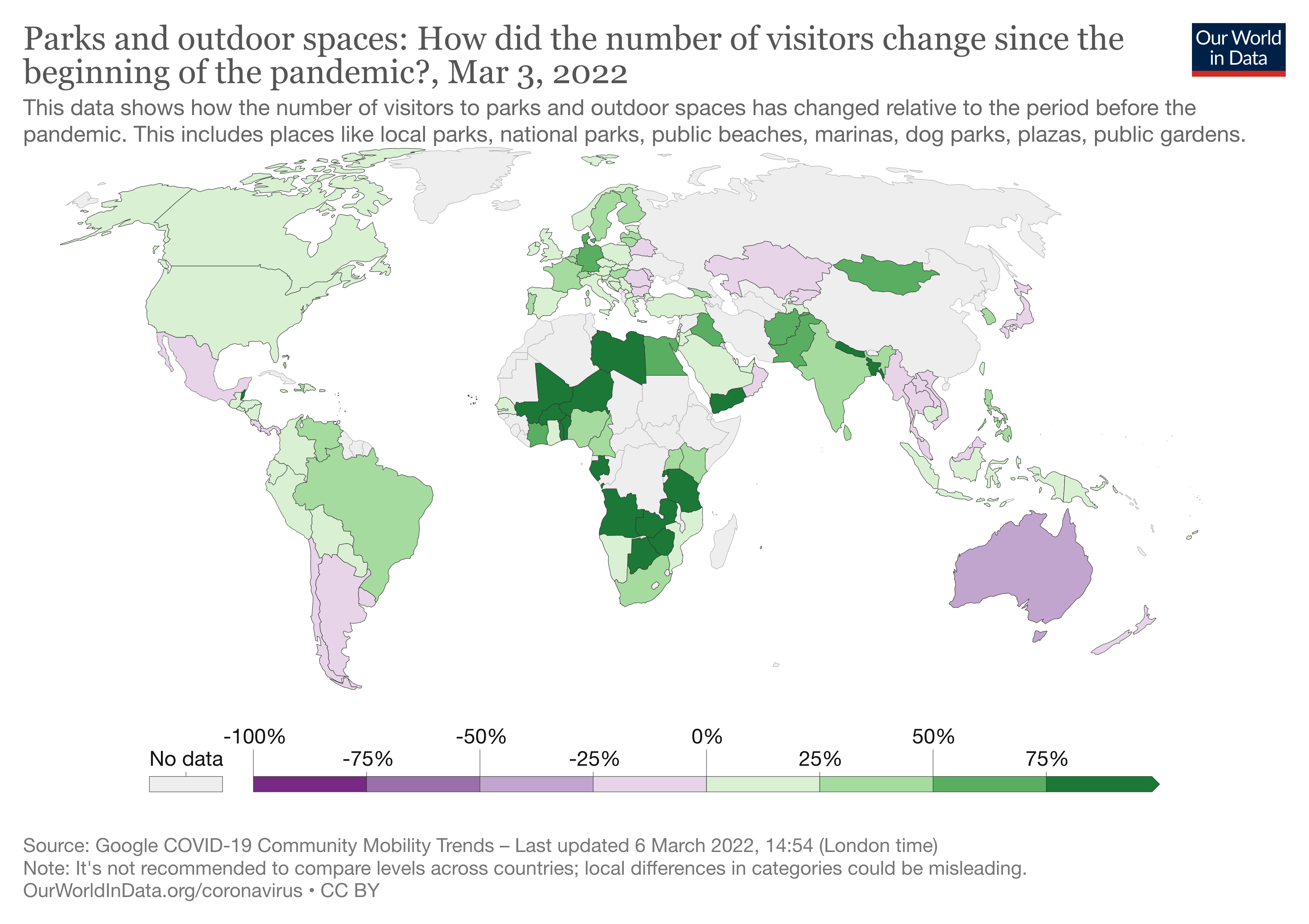
This interactive chart shows how the number of visitors to parks and outdoor spaces has changed compared to baseline days (the median value for the 5‑week period from January 3 to February 6, 2020). This includes places like local parks, national parks, public beaches, marinas, dog parks, plazas, and public gardens.
Billboard
Skyscrapper
Halfpage
Google mobility reports – a wealth of aggregated, anonymised data
Google is without a doubt one of the most important data sources in the world. With cities and communities all over the world still responding to the COVID 19 pandemic, the company has decided to share some aggregated, anonymised data on mobility patterns. According to Google, public health officials have mentioned that Google’s insights that are normally used for products like Google Maps could be useful in making decisions to stop the spread of COVID-19.
In late January 2022, Google announced that it would provide Community Mobility Reports for each country. These reports “aim to provide insights into what has changed in response to policies aimed at combating COVID-19. [They] chart movement trends over time by geography, across different categories of places such as retail and recreation, groceries and pharmacies, parks, transit stations, workplaces, and residential”, according to the company.
The reports are available for a limited amount of time and can be filtered by country. Google intends to support analyses of how effective policies of human movement reduction have been. It wants to show the impact on how and where people work, live, and visit across the world. The dataset will be updated regularly.
Google Mobility Reports: How to measure mobility?
Measuring mobility is no small feat, but Google is placed uniquely to support this endeavour. The company’s datasets show daily visitor numbers to specific locations, such as train stations, parks, and grocery stores. These visitor numbers can be compared to any other day to see changes that might have occurred during the COVID-19 pandemic.
The baseline for this analysis is the normal value for that weekday, measured as a median value for the time between January 3rd and February 6th, 2020. It is important to measure “that weekday”, as mobility patterns differ greatly between weekdays and weekend days.
Google’s mobility reports are available as PDFs (one per country). The charity Our World in Data has turned the mobility reports into interactive charts that can be used under a Creative Commons licence. The interactive charts help to see changes over time and the potential effects of COVID-19 policies. According to Google, it is important to not compare places across regions or countries due to local differences.
Other factors such as seasonal differences, events other than COVID-19 and the specificities of the pandemic are not detailed in the Google mobility reports.
Medium Rectangle
Halfpage


Google Mobility Reports – Change in visitors
The Google mobility reports focus on the number of visitors to measure mobility. While other indices use the number of vehicles or the number of trains, this measurement helps to show the actual movement of people.
The company has given clear guidance on how to read the data. For example, the residential category is the only one measures in duration rather than in visitors. Therefore, this category should not be compared with the other categories in the Google mobility reports. At the same time, changes in the residential category are rather small as people are always likely to spend a lot of time at home.
The other categories are more likely to show relevant changes. However, the “parks and outdoor spaces” category is highly dependent on the weather and on holidays, which is why some large spikes can be expected there.
These are the six different categories of Google’s mobility reports:
Retail and recreation
The “Retail and recreation” category shows the trends for restaurants, cafés, shopping centres, theme parks, museums, libraries, and movie theatres. It indicates how many people use these places on a rolling 7-day average compared to the baseline of early 2020.
Grocery and pharmacy stores
“Grocery and pharmacy” is a category that includes places such as grocery markets, food warehouses, farmers markets, specialty food shops, drug stores, and pharmacies. The interactive datasets at Our World in Data show a colour-coded world map with mobility trends for this category.
Public transport stations
This category shows the mobility trends for public transport hubs such as subway, bus, and train stations. It focuses on the transit of visitors in these places. Assuming that most of them do travel on public transport, this section of Google’s mobility reports shows important data on the usage of public transport during the COVID-19 pandemic.
Medium Rectangle
Halfpage


Parks and outdoor spaces
The “Parks” category includes places such as local and national parks, public beaches, marinas, dog parks, plazas, and public gardens. Apart from green spaces, blue spaces such as bodies of water, and public spaces are also included here. Here, some “dramatic spikes” are to be expected according to Google.
Workplaces
The “workplaces” category indicates how the number of visitors to workplaces has changed compared to the baseline days in January and February 2020. These visits can be correlated to the use of public transport to reach the workplace.
Time at home
Lastly, the Google mobility reports show mobility trends for places of residence. This category is measures in duration rather than in number of visits, which is why this category cannot easily be compared to other categories.
Sources
Hannah Ritchie, Edouard Mathieu, Lucas Rodés-Guirao, Cameron Appel, Charlie Giattino, Esteban Ortiz-Ospina, Joe Hasell, Bobbie Macdonald, Diana Beltekian and Max Roser (2020) – “Coronavirus Pandemic (COVID-19)”. Published online at OurWorldInData.org. Retrieved from: ‘https://ourworldindata.org/coronavirus’ [Online Resource]
https://ourworldindata.org/covid-google-mobility-trends
https://www.google.com/covid19/mobility/
https://www.google.com/covid19/mobility/data_documentation.html?hl=en
Read here about happy mobility.
Medium Rectangle
Halfpage
Billboard
Other Articles you may like


